Best Paint Colors With Honey Oak Trim and Cabinets (and Ones to Avoid)
Can't replace the orange oak yet? The right wall color can calm it down. Here's why gray makes honey oak look worse, which greens and whites work, and what else to change besides paint.
Hoceine
7 min read21 views
In this article
"Paint choice with honey oak" is a thread title that shows up on Reddit every few weeks, usually with a kitchen photo, a row of paint swatches taped to the wall and the word "help." Another popular one on r/interiordecorating was simply titled "Too Much Orange!!!"
Most people in those threads aren't ready to rip out cabinets or repaint every door frame. They want a wall color that makes the oak look intentional instead of dated.
Short answer: pick a wall color that either contrasts with the orange or complements it. Muted greens (sage, olive) work best because green sits across from orange on the color wheel and neutralizes it. Creamy warm whites and earthy taupes are safe choices. Avoid cool blue-grays, which make oak look more orange, and yellow-beiges, which blend in and look muddy.
Why do some wall colors make oak look worse?
Honey oak has strong orange and yellow undertones. Whatever you put next to it either pulls those undertones out or quiets them.
- Cool gray and blue-gray sit opposite orange in a harsh way. The contrast makes the wood look even more orange, and the gray looks dingy and cold next to it. This is the combination that dominated many 2010s flips, and it's the one people complain about most.
- Yellow-beige and tan are too close to the wood. With no contrast, walls, trim and cabinets merge into one muddy tone.
- Bright white can work, but a stark cool white makes the oak look heavier and more yellow by comparison.
The colors that work either soften the orange (muted greens) or sit in the same warm family while staying clearly lighter or darker (warm whites, taupes, deep earthy colors).
Which paint colors go best with honey oak?
Muted greens
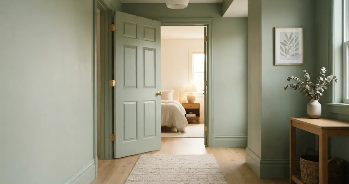
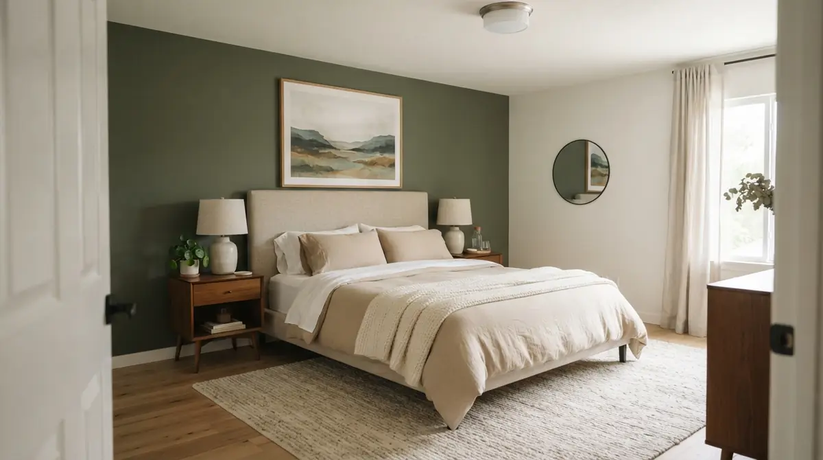
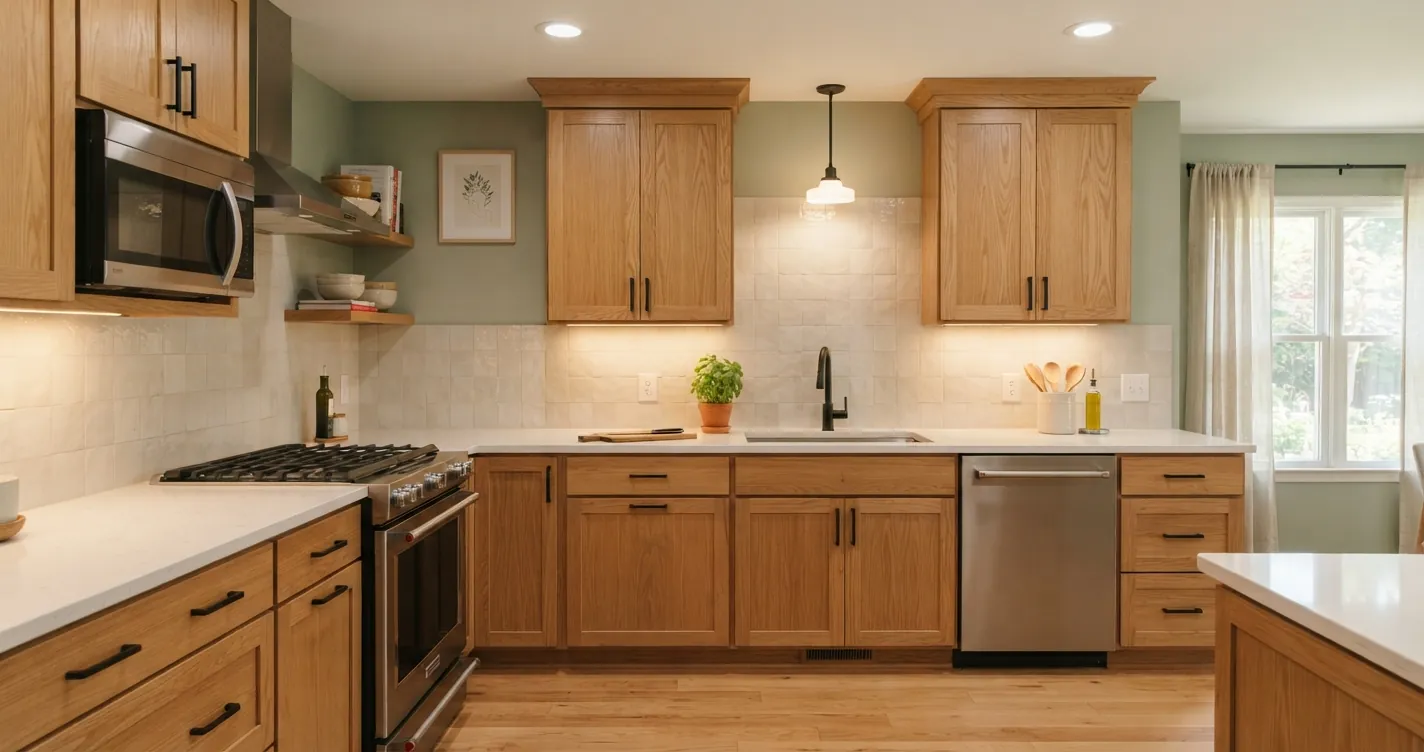
Green is the most reliable partner for orange wood. Keep it grayed or muted, not bright. Sage, olive, eucalyptus and green-gray all calm the oak and make it look closer to a deliberate warm wood. Colors to sample include Benjamin Moore October Mist, Sherwin-Williams Evergreen Fog and Sherwin-Williams Clary Sage. For a darker look in a dining room or study, a deep olive or forest green next to oak trim feels rich instead of dated.
Our sage green living room guide has more ways to build a room around green.
Creamy warm whites
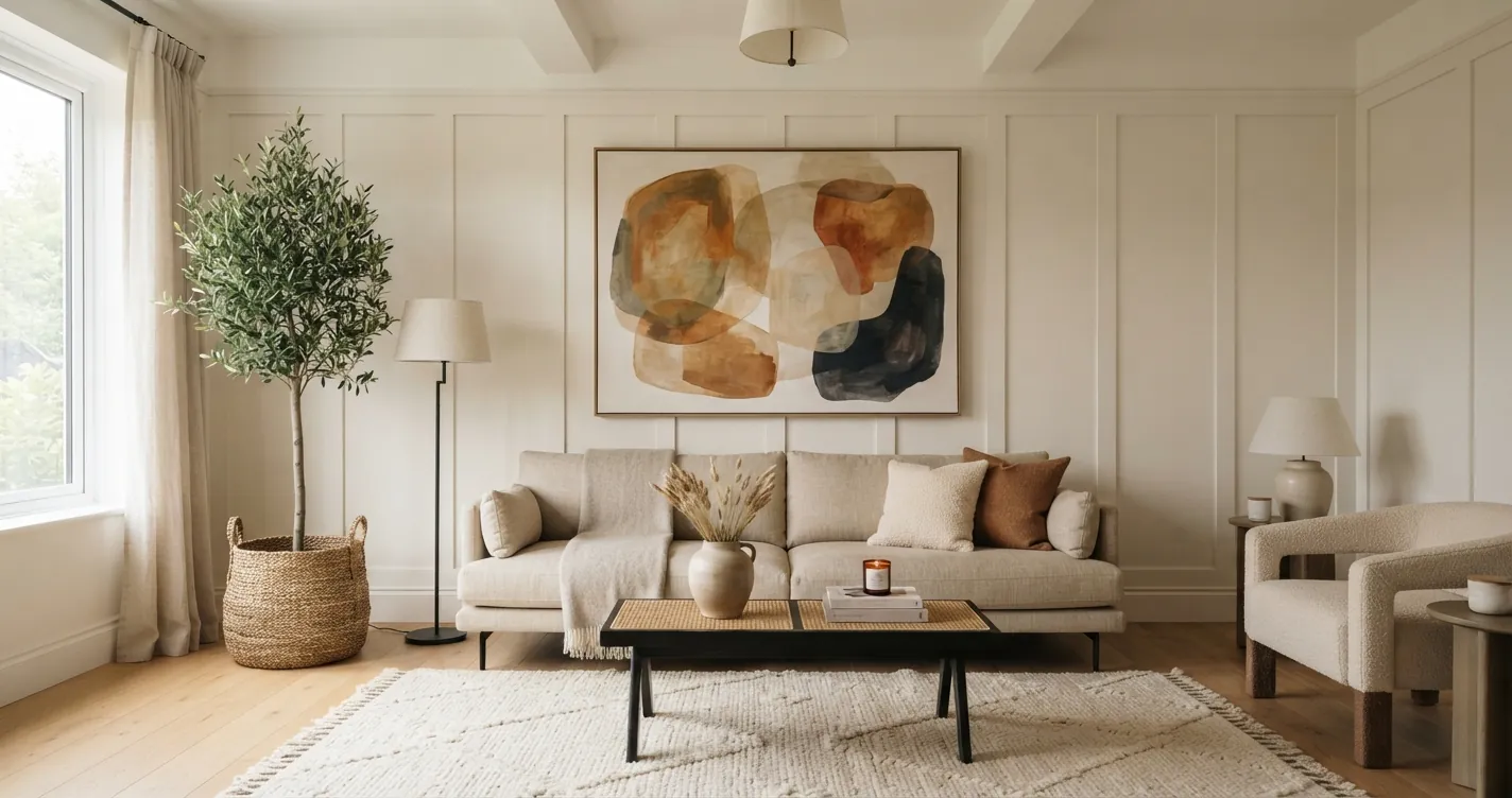
A warm white with a little yellow or beige in it sits comfortably next to oak without fighting it. Benjamin Moore White Dove and Sherwin-Williams Alabaster are popular choices. They give the room a light, fresh base while letting the wood read as warm.
Earthy taupes and greige with warm undertones
If you want a neutral that isn't white, choose a greige that leans warm. Sherwin-Williams Accessible Beige and Benjamin Moore Revere Pewter are often suggested. Sample them first, because Revere Pewter can read green or gray in some light and Accessible Beige can lean slightly pink-taupe.
Muted terracotta or clay
If you'd rather lean into warmth than fight it, a soft clay or muted terracotta wall makes the oak part of a deliberate warm, earthy scheme. This works best with darker floors and plenty of texture: linen, wool and woven baskets.
Navy or deep blue (with care)
Deep navy is a classic pairing with orange wood, because navy and orange are complements. A muted navy like Benjamin Moore Hale Navy on an island or one accent wall can look sharp next to oak. Use it in moderation; a whole room of navy next to oak trim can be heavy.
| Wall color family | Result with honey oak | Example colors to sample |
|---|---|---|
| Muted green (sage, olive) | Calms the orange, looks intentional | October Mist, Evergreen Fog, Clary Sage |
| Creamy warm white | Fresh and light, oak reads warm | White Dove, Alabaster |
| Warm greige or taupe | Soft, safe neutral | Accessible Beige, Revere Pewter |
| Clay or terracotta | Warm, earthy, leans into the wood | Sample muted clay tones |
| Deep navy (accent) | Strong contrast, works in small doses | Hale Navy |
| Cool gray or blue-gray | Oak looks more orange, walls look dingy | Avoid |
| Yellow-beige | Blends into oak, looks muddy | Avoid |
How do you use LRV to get the contrast right?
Light Reflectance Value (LRV) is a 0 to 100 scale showing how much light a paint reflects. Most paint brands print it on the swatch or the website.
Mid-tone honey oak sits somewhere in the middle of that range. If your wall color has an LRV too close to the wood, they merge. A good rule of thumb is to go clearly lighter (LRV around 70 or higher) or clearly darker (LRV under about 30). Avoid the 40 to 60 middle zone unless the color has a strong green undertone that does the contrasting for you.
That's why Alabaster (LRV 82) works, and so does a deep green. A tan around LRV 50 often doesn't.
What else can you change besides wall paint?
Wall color helps, but it's only one surface. The oak looks less orange when the things around it change too.
- Countertops. If you're replacing counters anyway, choose white, warm white quartz or a soapstone-style dark counter. Avoid busy brown and gold granite, which amplifies the orange.
- Backsplash. A white or cream tile, or a soft green zellige-style tile, creates a fresh break between counter and upper cabinets.
- Hardware. Swap brass-plated 90s knobs for matte black or a warm, brushed brass. Matte black adds contrast that makes the oak look deliberate. Our cabinet hardware size calculator helps you get pull length right.
- Lighting. Use 2700K to 3000K bulbs. Cool 4000K to 5000K bulbs make oak look pinker and more orange. The light color temperature calculator explains which bulbs to buy for each room.
- Rugs and textiles. A rug with green, blue or cream in it breaks up oak floors and cabinets. Avoid orange and red patterns that echo the wood.
- Mix in other woods carefully. Darker walnut or very light white oak furniture next to honey oak can look intentional if you repeat each tone at least twice in the room. See how to mix wood tones.
Should you just paint the oak?
Sometimes, yes. If the cabinets are in rough shape or you hate the wood, painting them is a big visual change for a modest cost. But plenty of people regret painting solid oak cabinets, especially after the trend swing back toward wood. Painted cabinets also chip, so the finish needs maintenance.
If you're on the fence, try it virtually first. You can see painted cabinets and walls on your own kitchen before deciding.
See the color on your own walls first
Paint chips look different next to oak than they do on a white card. Before buying sample pots, take a photo of the room and upload it to the Wall Painter. Tap a wall, pick a color and compare sage, warm white and taupe on the same photo, with your oak trim and cabinets still in view.
If you want to see what painted cabinets would look like, open the photo in the AI room designer and use Magic Edit to brush over the cabinets and ask for a new color or finish. You'll get several options to compare without touching a brush. New accounts start with free credits, so you can test your own room right away.
For a broader look at choosing wall colors, see how to choose a paint color for your living room.
Frequently asked questions
What color walls go best with honey oak cabinets?
Muted greens like sage and olive are the most reliable, because green offsets orange. Creamy warm whites and warm greige are safe neutral options.
Does gray paint go with honey oak?
Cool gray and blue-gray usually make honey oak look more orange and the walls look dingy. If you want a gray, choose a warm greige with a beige or green undertone instead.
Does white paint go with oak trim?
Yes, if it's a warm or creamy white such as White Dove or Alabaster. Stark cool whites can make oak look heavier and more yellow by comparison.
How do I make oak cabinets look less orange without painting them?
Use warm 2700K to 3000K bulbs, change hardware to matte black, choose a white or green backsplash, and paint the walls a muted green or warm white. Swapping busy granite for a calmer counter helps too.